What is the Pantone color of the year?
Some people think it's something insignificant, others wait anxiously the first week of December each year, for Pantone to announce the Color of the Year. Some say it's all about design trends at a global scale, others say it's a small group of people deciding upon a color that is going to appear a lot in that particular year and they know it, because products and collections are already being manufactured, so it's kind of "a self-fulfilling prophecy".
Pantone states that the Color of the Year is actually “…a color snapshot of what we see taking place in our global culture that serves as an expression of a mood and an attitude”. I think, it's really interesting that the director's Leatrice Eiseman professional background of the Pantone Color Institute is: "Psychology, and that's a very important part of color. Ever since I was a child I've had a passion for colors and a sixth sense and known how to use it. I started in fashion, but I got side-tracked by psychology and its color connection. I went back to school and got both my degrees in psychology, but I kept studying design. Color has an application in all of those fields."
For me, it's a source of inspiration, among many others. Especially because Pantone offers matching color palettes in different moods that are really interesting to explore.
2021: Ultimate Gray + Illuminating
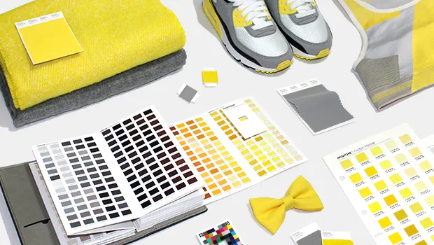
"A marriage of color conveying a message of strength and hopefulness that is both enduring and uplifting." -
Pantone
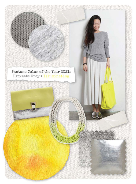
Pantone states: "PANTONE 17-5104 Ultimate Gray + PANTONE 13-0647 Illuminating, two independent colors that highlight how different elements come together to support one another, best express the mood for Pantone Color of the Year 2021. Practical and rock solid but at the same time warming and optimistic, the union of PANTONE 17-5104 Ultimate Gray + PANTONE 13-0647 Illuminating is one of strength and positivity. It is a story of color that encapsulates deeper feelings of thoughtfulness with the promise of something sunny and friendly.
A message of happiness supported by fortitude, the combination of PANTONE 17-5104 Ultimate Gray + PANTONE 13-0647 Illuminating is aspirational and gives us hope. We need to feel that everything is going to get brighter – this is essential to the human spirit."
2020 - Classic blue
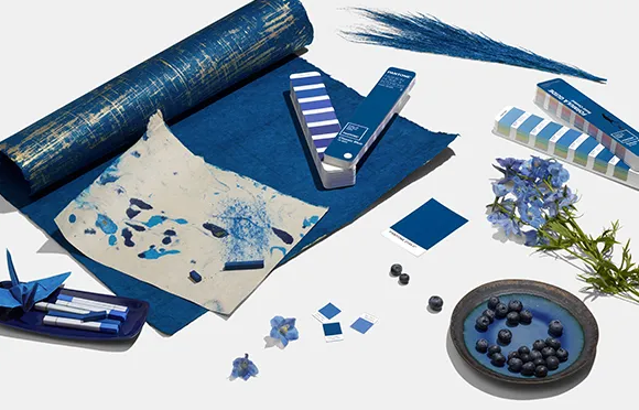
Picture Source: Pantone
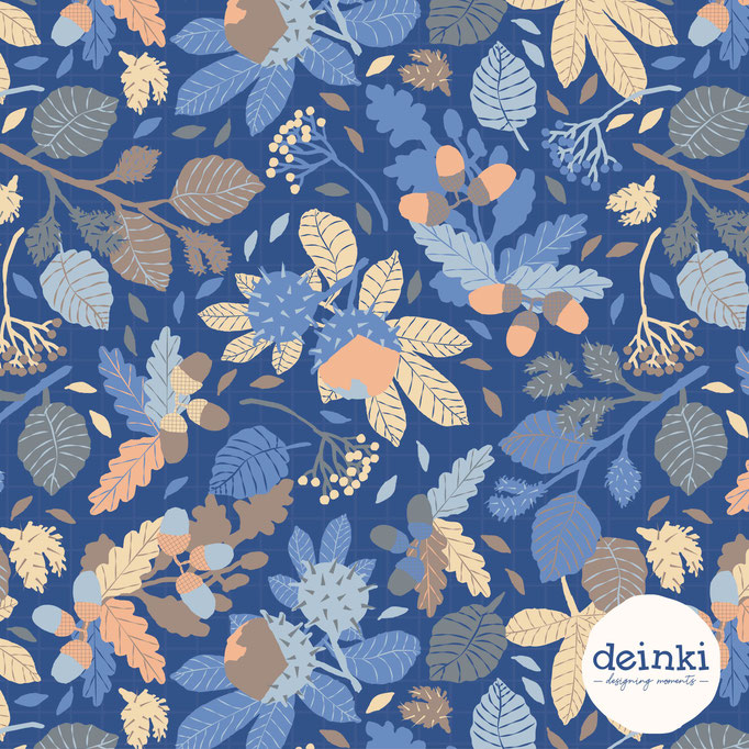
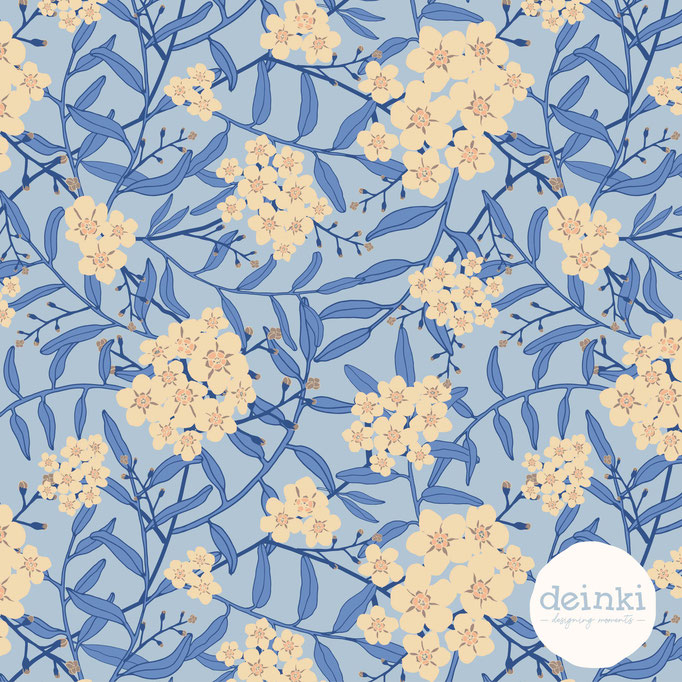
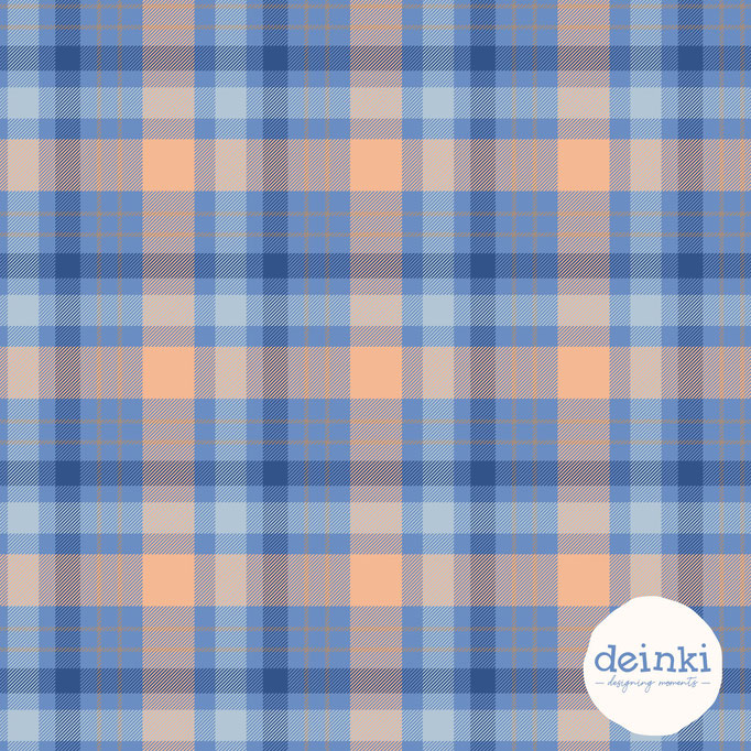
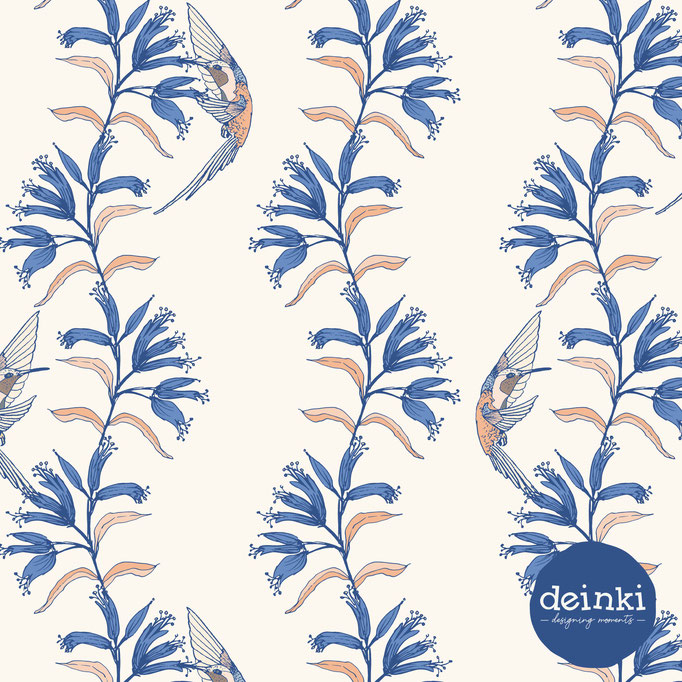
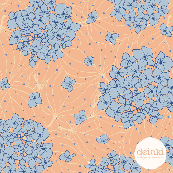
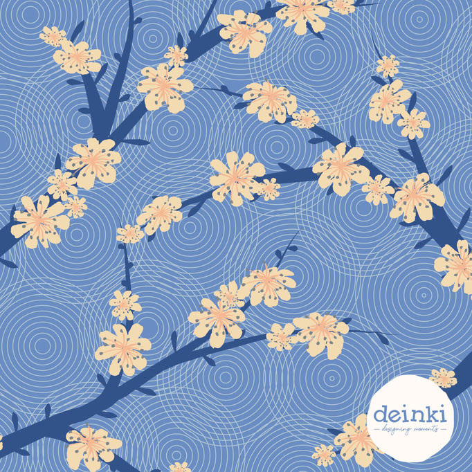
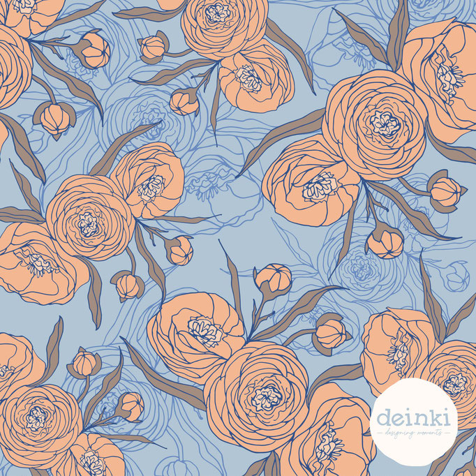
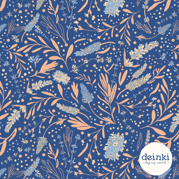
This January, I decided to recolor some of my favorite patterns in a Classic Blue palette. This was the result:
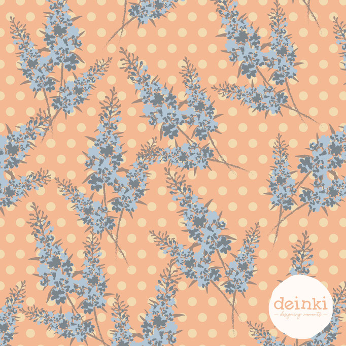
Spoonflower also presented a Limited Color Palette Design Challenge and I submitted my design, which ranked 45th.:


Past years
2019 - Living Coral
Picture Source: Pantone
2018 - Ultra Violet
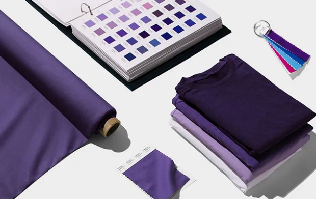
Picture Source: Pantone
2017 - Greenery
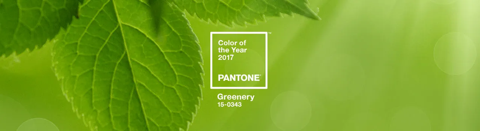
Picture Source: Pantone
2016 - Rose quartz + serenity
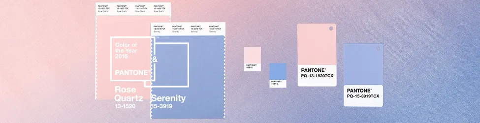
Picture Source: Pantone
2015 - Marsala
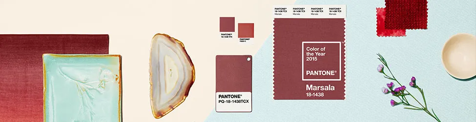
Picture Source: Pantone
What do you think of these colors?
Let me know in the comments!


Write a comment