
It's here... That time of the year... No, not Christmas! Well, that too. But I'm talking about the first week of December, the time of the year in which Pantone announces the Color of the Year. Many designers and color-lovers start analyzing, making guesses and bets the days prior to the announcement. And since color is so subjective and personal, many will love the announced color, many will hate it.
If you want to read about last year's color(s) and the ones before that, please read this blog post where I also explain a little bit what a Pantone Color is and why it is so important for people passionate about color and design.
Color of the Year 2022
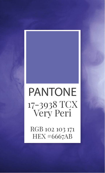
And the award for Color of the Year 2022 goes to... Very Peri 17-3938 TCX! (*crowd stand up and claps*)
Honestly, I like it! It's a bit out of my comfort zone in terms of the colors I usually use BUT hey, let's give this blurple (blue + purple) a chance!
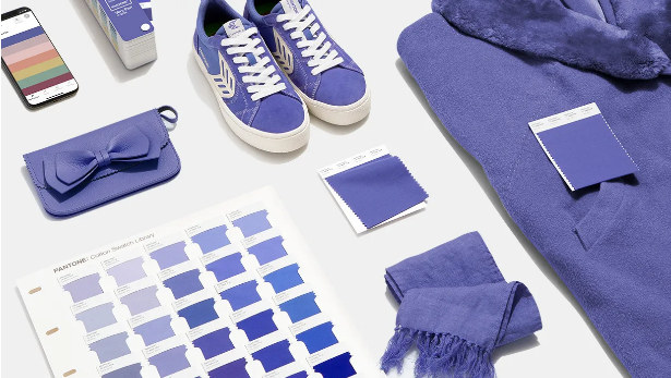
Image source: Pantone
I loved the explanation Pantone stated about their choice: "We are living in transformative times. PANTONE 17-3938 Very Peri is a symbol of the global zeitgeist of the moment and the transition we are going through. As we emerge from an intense period of isolation, our notions and standards are changing, and our physical and digital lives have merged in new ways. Digital design helps us to stretch the limits of reality, opening the door to a dynamic virtual world where we can explore and create new color possibilities. With trends in gaming, the expanding popularity of the metaverse and rising artistic community in the digital space PANTONE 17-3938 Very Peri illustrates the fusion of modern life and how color trends in the digital world are being manifested in the physical world and vice versa."
"Displaying a carefree confidence and a daring curiosity that animates our creative spirit, inquisitive and intriguing PANTONE 17-3938 Very Peri helps us to embrace this altered landscape of possibilities, opening us up to a new vision as we rewrite our lives. Rekindling gratitude for some of the qualities that blue represents complemented by a new perspective that resonates today, PANTONE 17-3938 Very Peri places the future ahead in a new light." - they add.

Inspiring Palettes with this Color
Here are some great color palettes suggested by Pantone including the new color rock star! You can click download to get the .ase file, which you can then add to your Adobe Illustrator and Photoshop color libraries. If you would rather work with RGB, click on the images to see the RGB and HEX values of the colors.


What do you think about the new color of the year?
Let me know in the comments!
If you would like to get 5 new and free color palettes including this color,
make sure you subscribe to my newsletter for fellow designers:


Write a comment
Karen Armstrong Studio (Friday, 10 December 2021 22:08)
I don't usually work with such saturated color as this, but I am willing to always stretch myself and will give it a try where it fits in with my style. I love the thought behind the choice of "Very Peri," here's to embracing our creative spirits and a new year - may it hold better things for us all!